Friday, September 6, 2024

Why You Should Use Microsoft Edge Profiles

Microsoft Edge has a cool feature that allows you to create separate profiles to keep your data separated. You can link these profiles to access Microsoft Work or School accounts, or Microsoft Personal Accounts. Where this is most powerful is keeping your work streams separated. For example, keeping shortcuts for work or school separated from your personal accounts. In my case its about keeping clients isolated from each other. 

Create a new profile

Let's first start by creating a new profile. Creating a new profile is pretty easy. In Edge, click on the … and then choose Settings.


Once in settings, you can click on Add profile and set up how you want the profile to act. These profiles are separated from each other so you don't have to worry about things like saved passwords and cookies which are stored separately. 


Sign into your profile account and all of your shortcuts and saved passwords will synchronize across devices. 

To switch profiles go into settings, scroll down and select the profile you want and choose switch. 


Faster profile creation and switching

There is a quick way to create and access a profile. Instead of constantly having to go through the settings page. Create a desktop shortcut to the profile. 

Create a brand new profile via shortcut

First, right click on your desktop, choose new and then shortcut. 


In the desktop shortcut, use the following link
"C:\Program Files (x86)\Microsoft\Edge\Application\msedge.exe" --profile-directory="New profile"
Replace "New Profile" with the name of the new profile you want to create, for example "Work" or "School". Give the shortcut a meaningful name and save it. First time opening it will create a new profile and then you can quickly access the profile thereafter. 

Create a shortcut from an existing profile

You can also create a shortcut from an existing profile. You will first need to locate your edge profiles to get the proper name. The profiles are located here
C:\Users\<YourUserName>\AppData\Local\Microsoft\Edge\User Data\
replace <YourUserName> with the profile on your computer. In my case i have many profiles that are just called "Profile". 


Find the one you want and then create a new shortcut and use the folder name as the profile-directory name. For example, the command for Profile 1
"C:\Program Files (x86)\Microsoft\Edge\Application\msedge.exe" --profile-directory="Profile 1"

Now you have a quick and easy way to get to those unique profiles. 

Friday, May 12, 2023

Microsoft Loop Components

When I looked at Loop a few months ago, I wasn't really impressed. The problem was I didn't have any context around what it could be used for. Since then, I have really come to love the service. 

In this blog you might see some inconsistencies. I left them in here to show that Loop is still not perfect and you may have to try a few different things to make it work. Certainly I had some unexpected results. At this time, Loop is still in preview. 

Loop has as much potential to disrupt content sharing as OneDrive did for sharing files. If you remember emailing documents around and all the crazy versions that resulted, then you know what I mean. It also has the same disruption potential as co-authoring in Office did. 

What is a Loop component?

Microsoft Loop components are like widgets that you place inside other communications. Each component is then related to all the others and is dynamic and updates in almost real time. Think of it like a hub and spoke of a wheel. The hub will be the data (pictures, text, surveys, etc.) and the spokes each connect to services like Word, Outlook, Teams and more. When a loop component is updated in one conversation area., it is updated in all places where that component is used. 

Vacation Planning Example

A big team trip is coming up this summer and I need a way to track and plan tasks with my crew. I have a few ways I could do it.

  • Planner
  • Microsoft Lists
  • Excel spreadsheet
  • Email messages
Each of those comes with advantages and disadvantages, which I won't cover hear to save time. This is a post about Loop after all. 

Let's begin!

I'm going to start by sending an email with a Loop component embedded in it to start the conversation. I open a new email, start typing my email and then I choose Loop from the Collaborate menu.
First thing is a voting table. 
 

Once the component is added, I fill in my ideas with some optional pros and cons. Several things you will notice. 
  1. A link is created in the upper right corner. This is a link to the "hub" where the data is stored. 
  2. People who are in this Loop component. It's just me right because I haven't emailed it yet. 
  3. The table that will be shared and will editable with everyone. 

I updated my component and clicked send. If I log in as another user, I get a copy of the email and I can select the component and vote on the one I want. For this example everyone is voting for the island adventure. While it's hard to see in static images, my table was updated with votes, I can see who voted for what option and I can see who is currently on the page. 

Something that has recently gotten better is that permissions were automatically added to the Loop component based on the people invited to the email message. In the past you sometimes had to go back in and invite each user. 

Next steps, Planning! 

Now we get to see the real power of loop. I'm going to embed the content of the Loop in several places. First, I will be working from the web version, Kori from Teams, Garfield from email, and Rachel from Word. We can all work together simultaneously. To get is started I'm going to create word doc in a Teams channel. This next step isnt as smooth as it could be but I'm guessing it will get easier. I created a new document in Teams and in the ribbon I can add new loop components, but I cannot see the ones that already exist. 


That's okay because we can log into the Loop website and copy the component. Log into https://loop.microsoft.com and look at the list of recent items. I can see that the component I am looking for originated in Outlook.


I can open the component and I can interact with it. I can also click the Copy as Loop component link and that will allow me to place that Loop in other locations.

 I pasted the link directly into Word and it recognized it as a loop component, but at this time there is still a bug in Word embedded in Teams and the component doesn't render right.
 

Opening it in the browser version of Word makes it render properly. 


The desktop version also has the same issue as Word in Teams. 


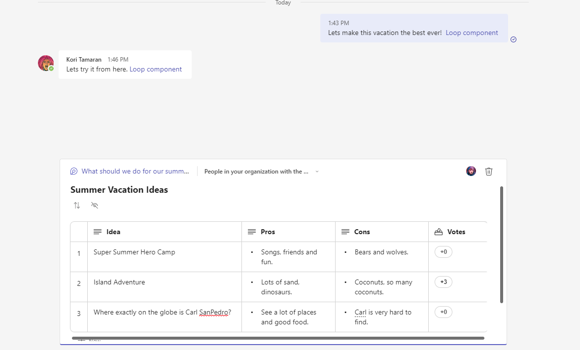
I am also adding the loop component to the Teams chat window. Apparently it matters HOW you paste the link. I tried a regular paste, and you can see it just made a link. But ctrl-shift v rendered the component. I tried to paste it into a channel and it would never render and just left me a link. 


Freeform Collaboration

I will ask the team for idea on which activities they want to do for camp. By selecting an open area and typing a "/" i get a menu of the things i can do. I can add a task list and a bunch of other components. The will add their ideas in their respective technologies. 
Everyone added their content in their respective tools with tags applied to each persons writing. 


Assigning tasks

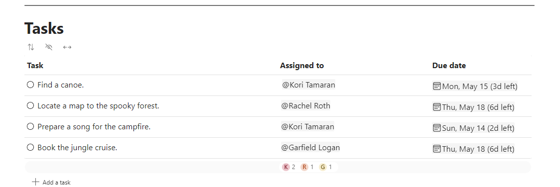
The next powerful piece is creating actionable items from the things you are working on. Lets create a task list and  assign tasks to be completed. The best part is these tasks are real tasks that will soon be connected to To Do and will show up in Outlook. 


As I fill in the tasks, emails are sent to their respective owners. 


Here an email is received with a link to the component, so no context switching out of Outlook. 


While To Do and Planner tasks did not roll out to my tenant yet, it's coming soon. I will update it when I can. For now, we have to complete the tasks in any of the tools we are working in, web, Word, Outlook or Teams. 

Conclusion

This is a very exciting tool to use and is still evolving. I can see this being used for standups reporting, budget planning and all sorts of things that collaboration is needed. Please give Microsoft your feedback and I know this will keep getting better and better. 


Thursday, April 6, 2023

Confusion Surrounding Get changes for an item

Power Automate has this really cool action that allows you to see changes to an item. Sometimes when an item is updated. you need to take a specific action based on that change. This action is critical when you are using a "When an item is created or modified" action as the trigger. 

Use case for the action

This is a very simple workflow that is going to trigger when an item is created or updated. If this item gets updated a lot, it will trigger every time that the item is modified.  If you aren't careful, you could cause an infinite loop, or you could cause too many email notifications to go out, or maybe your calculation is updated too many times. 

How this action works and reports changes

All this action does is review the changes of an item based on the versioning between the current item and the one just before it. The deltas are then stored in a collection that records true or false. True means this column was changed. False means this column wasn't changed. Simple!

Take actions based on the changed columns

What can I do now with my collection of true and false values? In this simple example we will take action only when the title has changed. The workflow has one branch that sets a single variable to either yup or nope.  

A simple workflow with a condition

When an item is updated or changed, the first action retrieves the item. The second action then does a compare between the current item and the previous one stored in the list. Versioning enabled is required for this to work. You can get really fancy and have these two actions compare in different lists or compare different items. That's beyond the scope of this conversation but it possible. 

To properly set up the action, you have to define a few parameters. Pass in the ID of the item from the previous action and set up the since and until fields. Those two fields give the action boundaries to work within. If you didn't provide boundaries, it wouldn't know what versions to look at. 


The best boundaries to use are the workflow tokens. Here is a close up of the value I use. 


In the Condition block, all we need to do is look to see if there is a true or false value in the column we are observing, and then take action based on that. 

The workflow with data

Now we will see what it looks like with changes. This action is really long with lots of details. Click on it to zoom in

We can see the ID of the items that we are currently looking at.
Since version number is the old version
Is current version is the current version

Then there are a bunch of  "Has Column Changed" fields. These are the true or false Boolean values letting me know what columns have changed in the item. In this instance, the Title column has changed and is now true. In the condition, the expression evaluates to true so we go down the If yes path and can take whatever action we want.


 On a subsequent run where the title did not change, the workflow still executed but we observe that the firstname column changed is true and not the title column. 


and because of that, the condition evaluated to false. 


Conclusion

I hope you enjoyed the lesson! Writing this article helped me a lot to understand how powerful this action can be. 


Tuesday, April 4, 2023

PowerApps sudo CSS

 Something that is missing in PowerApps as of the writing of this post is the ability to apply formatting to all data cards and their elements at once. I've seen a few people say you can select all and make changes but I have never had any luck with that. Until Microsoft updates this ability, here is a workaround that takes a bit of work up front, but pays off in the end. 

Set up your fake CSS

Every data card has a lot of elements in it. You can use the code below as a starting point. This code has the most common items inside a data card that I typically apply changes to.
//the data below is set in 4 places, make sure any changes are copied there.
//Click ... next to App and choose "run onStart" to view changes
//the 4 locations are: App "OnStart", Sharepoint integration "Edit, View, New"
//datacardkey
Set(varDKBorColor, RGBA(0, 0, 0,0 ));
Set(varDKBorStyle, BorderStyle.Solid);
Set(varDKBorThick, 1);
Set(varDKColor, Color.Black);
Set(varDKFill, RGBA(255,255,255,1));

//datacardvalue
Set(varDVBorStyle, BorderStyle.Solid);
Set(varDVBorThick, 1);
Set(varDVColor, Color.Black);
Set(varDVFill, RGBA(255,255,255,1));

//datacard
Set(varDCleftCol, 0.2); //this one and one below must equal 1
Set(varDCrightCol, 0.8);
Set(varDCBorColor, RGBA(166, 166,166,166));
Set(varDCBorThick, 1);
Set(varDCBorStyle, BorderStyle.Solid);
Set(varDCFill, RGBA(255,255,255,1));
Set(varDCFont, Font.Arial);
Set(varDCFontW, FontWeight.Normal);
Set(varDCFontS, 9);
Set(isVisible, false);

What I have done is set a bunch of variables that I am going to reference in each card. I have each section separated out as an easy way to remember what element they belong to. You can organize them any way you see fit. I also try to name the variables by their location. In the very first item, varDKBorColor, I would apply that to the Border Color of the Data Key element in the datacard.  

Where to apply this code

I'm going to just go start with PowerApps in horizontal mode which is the most difficult to work with. 
This is a simple form with a few fields and a button that saves the item back to a list.


The first thing to remember is that on a SharePoint form, the SharePointIntegration overrides the default App commands. So, if you are editing your form in the editor, changes made in the editor here will not be applied to the New, View and Edit forms when launching the from a SharePoint list. It will make sense in a few minutes. 
Open the App link from the left side menu, and locate OnStart action. 


Then copy the code from the code block from "set up your fake css" and paste it into the command window. Expand the window to see as much as you want. 


Next, I have to get these variables to initialize. To do this, I click the ... menu next to Apps and choose Run OnStart
 

This initializes all the variables I will using and makes working in the editor a lot easier. I can review the variables in the Variables section of PowerApps. Any time I change a variable value, I just re-run Run OnStart for them to apply.


This can be useful for troubleshooting. 

Apply the CSS to a DataCard

Now for the fun part! 
From here it's a lot of copy-paste actions. Its way easier to copy paste than to type everything. 
First select a card and unlock it if needed by right clicking and choosing Unlock. 

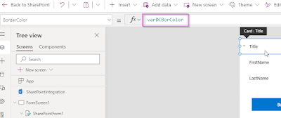
First I will do BorderColor by selecting it from the dropdown.


Replace the text thats in there with your variable. In this case varDCBorColor


I will repeat this action on the other border elements, BorderStyle and BorderThickness. PowerApps alerts me that these items have been modified by showing them in bold. 


I am starting see the styles take share. but for impact, I applied the variables to each of my datacards. Below you can see consistent formatting of the border. 

Repeat this process for each element from Font size to Fill colors. 

Make changes to styling

I can now make a change to a variable, run the OnStart action and every place that variable is used with get the new style. 
Here I and going to change the color of the border and make it 5 pixels. 


Now I run OnStart and I didn't have to click on any DataCards. 

Adjusting the left/right DataKey and DataValue elements.

I wanted to show a more complex part of this, and that's the ability to adjust the placement of the elements. Maybe you want the DataKey label to be bigger or smaller or maybe the form will be responsive. Hard coding items breaks responsive form sizing. I can leverage variables to help there too.
Look at the Width calculation for the DataKey. It's using a calculation to get the width so that it takes up 40% of the space, I want it to take up 30 percent and the Value card to take up 70 percent. 


Replace the 0.4 with the variable varDCLeftCol (or varDCRightCol if you are on the data value) just make sure the totals of the two variable equal one. It won't hurt anything, it will just give you more white space than you expect to see as show below. 


Now the variable is applied to the data card value to take up the extra space. 


Shortcuts where we can take them

There are a few things where we can take a few shortcuts. If you click on a data card, and select "CTRL-A" to select all, you can apply things like fonts and text sizes to the entire contents of the data card. Take the advantage when you can to prevent have to paste over and over again. 


Apply your formatting for SharePoint 

If you are applying this formatting to a SharePoint list form, you will need to copy the variables to multiple places in the SharePointIntegration section of the PowerApp. Click SharePointIntegration  to activate it.


Then add the variables to each of these sections. 


There is a benefit to having separate sections like this, you can change the format for each mode. If you want Helvetica for OnView and Segui for OnEdit, go for it! 


Conclusion

A little bit of extra work in the beginning of the project can make modifying these forms in the future a lot easier. In the future, I hope that we can simply apply formatting just like we do in CSS on web pages and this will have to do until then. 


Monday, July 13, 2020

SharePoint Quick Links Buttons that Go Nowhere

The Problem

When building out a test site where we might not have a lot of real content yet, we often want to create a bunch of quick links buttons so designers can get a feel for what content is going to look like. This is particularly important when you want to review a bunch of designs and test them on mobile. Typically I would create buttons that would link to my favorite external sites like Microsoft.com and Weather.com. On sites with 15 buttons that got a little boring.

What would be better?

What typically happens in HTML, an anchor tag will be created with just a # in the link which tells the browser to create the button and make it work like a button but don't actually link anywhere. If we could add that # to the link life would be great! 

So why are you telling me this?

The quick links and other button web parts have a validation in them that prevent us from just adding a #. 

The Solution

First we add the web part to the page and add a link. 
quick links web part


Then we type a # into the paste a link section. You will notice that the "Open" button never clears validation so it cannot ever be clicked.
image web part validation is still not met


If we type in a valid URL the button validation clears. If you are following along, don't press open yet!
image the button validation is met and is clickable


Now we just need to go back, erase our URL and replace it with the #. Our button remains clickable.
replace the url in the field with a hash


Now we have ourselves a beautiful, clickable button to nowhere.
image of a button


In conclusion, this is one extra step to make a button that goes nowhere but when you are testing design, it is really nice when you click a button and the browser stays right where you want it.

Wednesday, August 28, 2019

Keeping SharePoint Prod and Dev Farms in Sync

A Warning

This article is going to be a disappointment to most of you who are hoping I have stumbled onto the Holy Grail of farm syncing. This is an explanation of why it can't be done without consuming an extraordinary amount of effort, time and resources.  

The Challenge

How many of you have heard this statement before:

Build me two identical SharePoint farms

Until recently, I was unable to effectively explain to SharePoint and Non-SharePoint people why a SharePoint UAT farm and a SharePoint production farm couldn't always be exactly alike. The expectation is I am going to give them a way to keep them perfectly in sync.

Where the frustration begins

In my experience, most SharePoint farms are not managed by a full time SharePoint person but instead are run by a single part time person. The IT department is stretched a little too thin, they are working long hours and budgets just can't justify a dedicated resource.  The team really just wants something easy to work with so they can see their family on weekends and syncing their Prod and UAT SharePoint farm isn't their highest priority. The solution I hear most often is "Can't I just clone all the servers?" You should all know by now the answer of course is no, no you can't. Cloning servers seems to always be the go to answer because so many other applications can be built with an identical footprint and then cloned to keep them in sync. Modern cloning tools are savvy enough to update the inner working of many of the applications we use and to make sure nothing causes a conflict. I think the last time we were able to clone a SharePoint environment with a high level of success was way back in 2003. After the clone, you still had to run a bunch of stsadm commands to make it work right.

The Explanation Part

 I was always bothered by the fact that I could never explain without going into super technical detail why cloning was just not going to work. A point of pride in me is being able to come up with an analogy to help explain the problem in a way that makes sense to everyone. 
Like when Doc Brown slipped on his toilet and came up with the Flux Capacitor, my moment came with much less excitement while driving home and sitting in traffic.

The Good Part, the Analogy

While I was on my drive home, thinking about my Nissan with 250,000 miles on it, I was pondering why some cars last so long and others die young and that's when it hit me.
When you start off setting up a SharePoint farm and you use a script like Autospinstaller, you are as close a possible to creating two identical farms. It's just like 2 Nissan's rolling off the same assembly line. Each car is as close a possible to being identical. In SharePoint, each farm has that nice new site collection smell and when you log into Central Admin and the SharePoint error bar is actually green, it's indeed a fantastic, satisfying day!
Unfortunately that's where things end. Just like those brand new Nissan cars, each SharePoint farm will have a totally different life. If cars are expected to live by the same, perfect, exact match rules that IT enforces, people will laugh. Think about how that might work, you are expecting each Nissan to be identical for its entire life and to be identical the day it's retired. I doubt any person would expect that to happen.
Every person knows that cars start off the same but as they get driven, accessories are installed, accessories are removed and you drive them differently. They end up being very different after a while, especially when you crash one. Cars and SharePoint are almost never right again after a crash.

Conclusion

Here are a few tips to help you out

  • Do not experiment in your UAT and Prod farms. Only test out 3rd party and custom packages in a development environment. 
  • Do not look at content as an item to keep in sync. It's bad form to have all the content from Prod sitting around in UAT. 
  • Do use a tool like Autospinstaller and SPDocit to document your farm configuration. There are always add ins and packages that are often forgotten. 
  • Do set the expectation that two farms will never be identical!  
Hopefully this helps set a proper expectation with your SharePoint farm syncing adventures. 

Friday, December 9, 2016

Kids and Chores

The other day the Bert Show (a locally syndicated radio show in Atlanta) asked the audience the best way to reward their children for chores. My wife heard the episode and suggested that I tell everyone my method. My wife and I have tried a lot of different approaches and none are 100% effective. Every method seems to work for a few weeks and then parents get lazy and then the kids get lazy and no one gets anything done.

Here are my simple rules
  1. Don't make the chore ambiguous. Don't just say "clean the kitchen" break it down into excruciating detail. Kids don't do well with ambiguity.
  2. Reward right away, not a week from now. This is where my favorite tool comes into play, an app called Chore Monster. This app is perfect for helping kids and adults because it lets kids mark their chores complete. It also teaches kids how to "save" money because as kids accumulate points they can get more valuable items. Please check them out.
  3. Just accept the fact you will have to remind kids about chores every day. That was my biggest problem. I would always ask the kids "why can't you remember to put away your shoes?". Now instead of asking about every single chore I just say "Time to check my Chore Monster!" and there will be a flurry of activity as the kids run around doing their chores and marking them off.
  4. Don't expect perfection. Let's face it, these are young kids and they will get better at chores the longer they do them.
  5. Most important, charge them a fee. Just as you have to give positive rewards I think negative rewards are just as important. More on this below. Bankrupt them often. 
Chore Ambiguity
I think this is where a lot of parents have the most frustration. You and I as adults know what it means to go clean something like the kitchen. To a kid the kitchen is a big place and most of the items in there are not supposed to be touched. They may not know where to start. That's where a specific list of chores is most important. This is the list of chores I expect my kids to do. These chores and rewards correspond to the items I have created in Chore Monster.  
All of my chores are based on dollars. 10 points equals 10 cents. The kids can cash out and take the money or there are other rewards they can get. All these items are stored in Chore Monster.

Charge them a fee
Face the facts, there are some things that we just don't want to do. Maybe you absolutely hate doing the dishwasher. I think kids feel the same way and I actually believe that's fine. As in life, if you don't want to do something you typically have to pay someone to do it for you. The big item in my house is emptying the dishwasher. The kids have the option not to do it. The result is they have to pay me to do it. My going rate is what is on the chore list. If I load and unload the dishwasher I collect 50 cents, cash, immediately. I don't accept credit. I have bankrupted my kids numerous times this way. When they are out of money they have no choice but to do the chore. 

If possible, reward right away
Things like device time I give right away. If the kids want cash, that only comes twice a month. They get paid the same time my payday comes. If they spend too many points on device time, they can't get any money. As i said earlier, bankrupt your children often, they will thank you later in life.